
Batman The Dark Knight Font
Batman The Dark Knight Font captures the dark sophistication and modern intensity of Christopher Nolan’s celebrated Batman trilogy. Defined by its sharp geometry and commanding style, the font reflects the brooding world of Gotham City and the complex character of its hero. Its angular edges and bold structure embody strength, mystery, and cinematic depth—making it a perfect fit for any design that aims to channel the spirit of the Dark Knight.
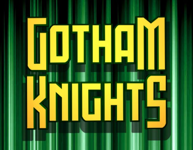
Download The Dark Knight Font (Gotham Knights) here: Gotham Knights Font
Debuting with the 2008 blockbuster, The Dark Knight redefined superhero cinema through its depth, realism, and impeccable design. The film’s typography mirrors these same qualities—commanding yet refined, evoking both chaos and control. Designers often choose the Batman The Dark Knight Font to bring cinematic drama, precision, and grit to their creative projects.
Although Warner Bros. and DC Comics have not officially released the typeface, fan recreations like the Gotham Knights Font and Dark Knight Rises Font perfectly emulate the film’s visual style. Each variation captures the grandeur and intensity that made Nolan’s trilogy unforgettable.
The enduring legacy of the Batman The Dark Knight Font shows how powerful typography can define an entire cinematic era. Like Batman himself, it stands for resilience, mystery, and timeless impact—making it a lasting favorite for creators inspired by the legend of Gotham’s protector.


