The Good, the Bad and the Ugly Font
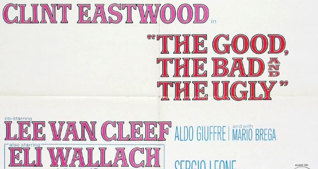
The Good, the Bad and the Ugly Font captures the rugged and dramatic essence of Sergio Leone’s legendary 1966 spaghetti western. The title design mirrors the film’s gritty tension, reflecting its timeless atmosphere of danger, duels, and moral ambiguity. Much like the iconic score and sweeping desert vistas, the typography stands as an integral part of the film’s cinematic identity.
The bold, weathered letterforms convey the raw power of the Old West—perfect for designers seeking to evoke frontier grit or vintage western drama in their projects. Its strong, commanding presence recalls the stoic intensity of Clint Eastwood’s Man with No Name, while maintaining a distinctly handcrafted feel.
Font Used: While the original typeface was never officially released, the design closely resembles Good Bad Ugly Font and Bay Tavern Out SL Regular. These alternatives successfully emulate the rough, condensed look of the movie’s classic title design, making them ideal for posters, fan art, or western-themed graphics.
Download The Good, the Bad and the Ugly Font Alternative here: Good Bad Ugly Font
About The Good, the Bad and the Ugly
Released in 1966, The Good, the Bad and the Ugly is a masterpiece of the spaghetti western genre directed by Sergio Leone and starring Clint Eastwood, Lee Van Cleef, and Eli Wallach. Set during the American Civil War, the film follows three gunslingers competing to find buried Confederate gold. Known for its iconic score by Ennio Morricone and its revolutionary cinematography, it remains one of the most influential films ever made—defining both the look and sound of the modern western.
